Preparing this pagePreparing page content.
Brand identity & social art direction
AL MALEKA Jewelry
A long-running jewelry brand relationship spanning identity modernization, product photography, art direction and evolving social-media systems.
- Role
- Logo modernization, photography, photo editing, art direction, social design, content planning and visual system development
- Year
- 2022
- Discipline
- Branding · Art Direction · Photography
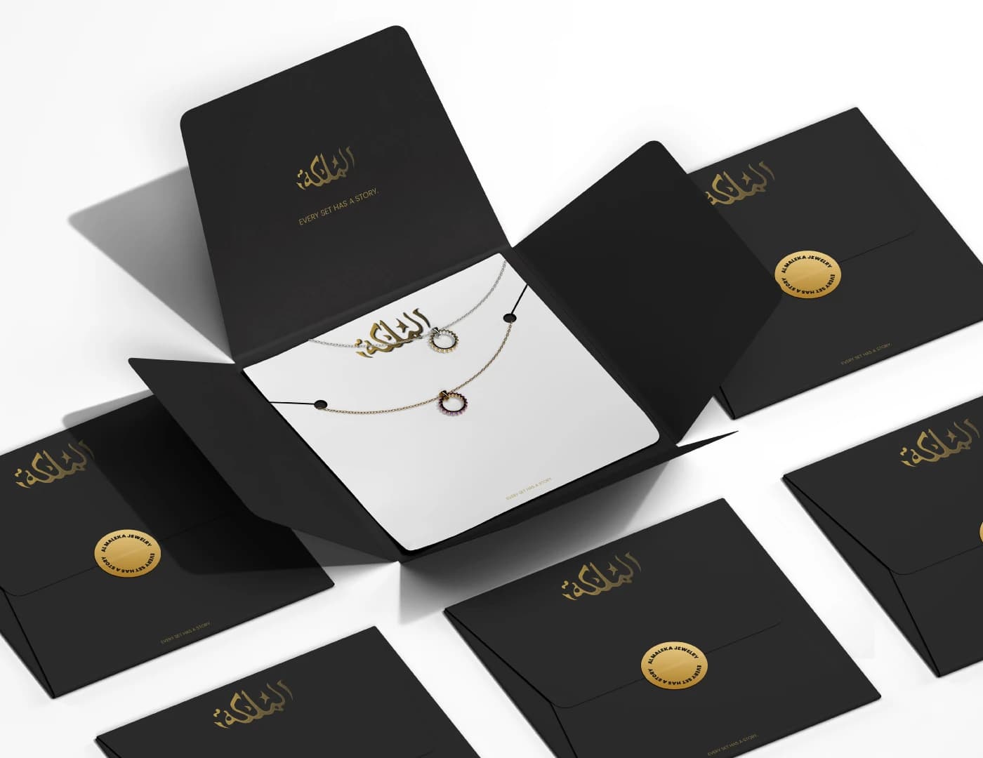

Modernizing a familiar jewelry identity without losing the character customers already recognized.
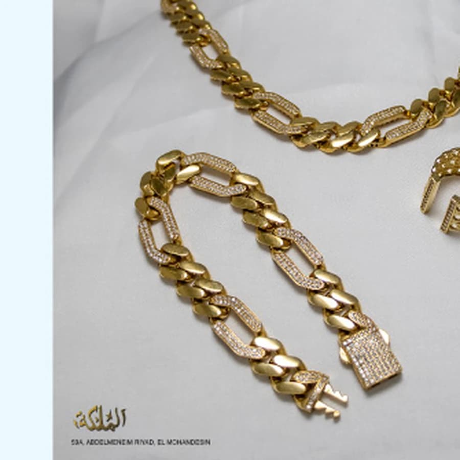
Let the jewelry do the work.
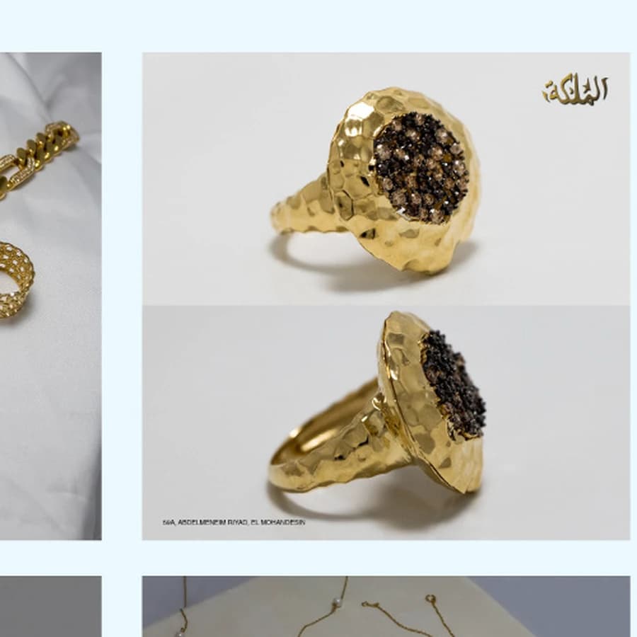
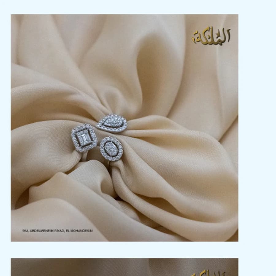
The photography was intentionally kept product-focused, letting customers inspect the pieces without hiding them behind elaborate sets. Close-up details, lock mechanisms, stamps and finishes became part of the selling story rather than decorative afterthoughts.
Building a recognizable Instagram rhythm.
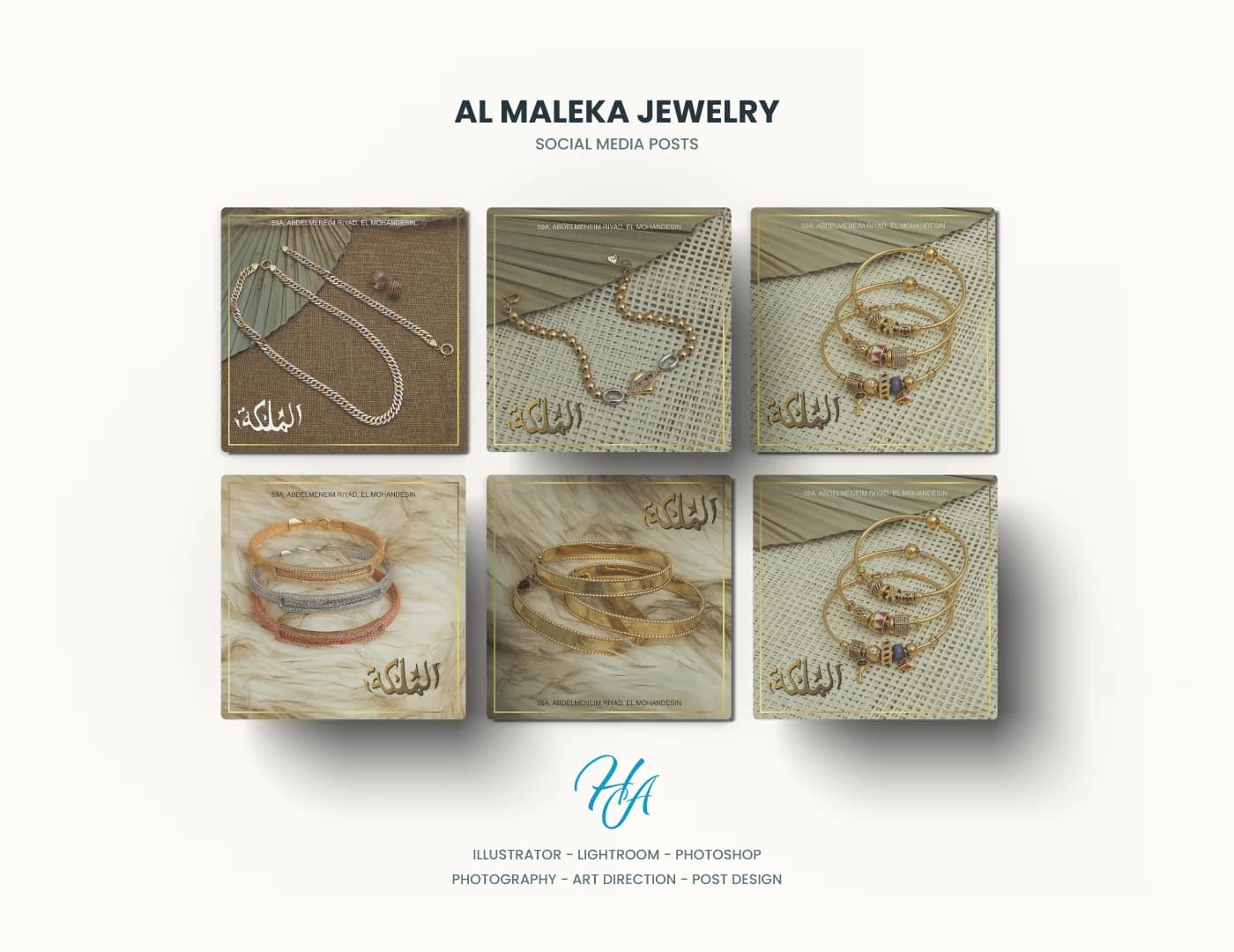
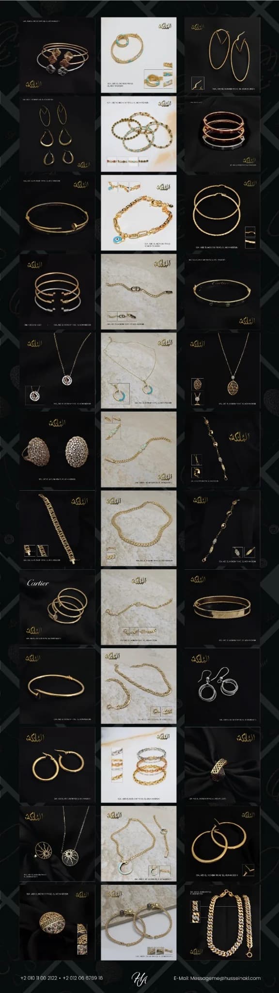
The content system had to do two things at once: keep every product easy to inspect and make the grid feel intentionally branded. Dark navy treatments gave older high-demand products stronger contrast, while lighter ceramic and fabric setups introduced new pieces without losing the brand's gold-led visual language.
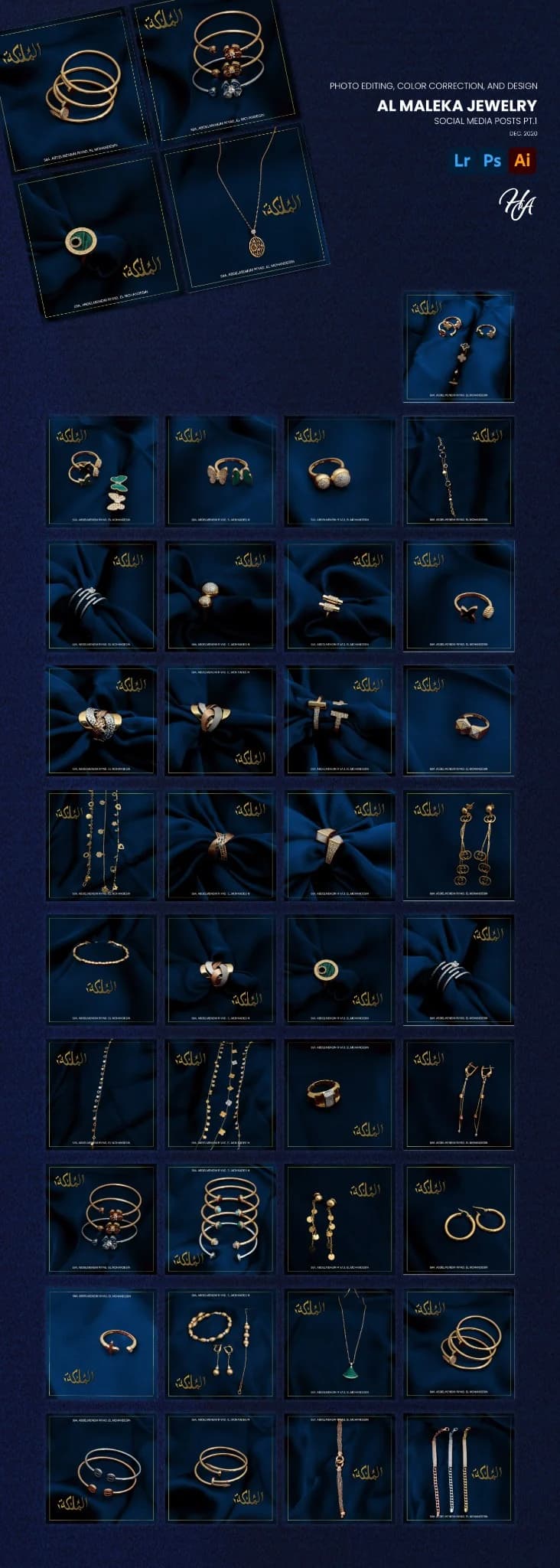
The visual language evolved with the product mix, while the grid remained recognizably AL MALEKA.
Project notes ↓
The useful details.
AL MALEKA Jewelry evolved across several years of identity and social work. The project began with a modernization of the Arabic wordmark, then expanded into product photography, visual direction and a flexible Instagram system designed to keep jewelry details clear while giving the brand a recognizable rhythm.
RelationshipClient work
PresentationFull case study
RoleLogo modernization, photography, photo editing, art direction, social design, content planning and visual system development
Year2022
StageMulti-year engagement
DisciplinesBranding · Art Direction · Photography · Social
Logo modernizationProduct photographyPhoto editing & color correctionSocial media art directionPost designContent planningInstagram grid system
More of the archive
Want to keep exploring?
This case is part of a curated selection. A broader portfolio lives on Behance and HA Creatives.